

How we raised $10 000 through a virtual fundraising event during a global pandemic
For ABLE Singapore’s 10th anniversary, we worked on a celebratory logo, refreshed brand messaging and identity. We focused on ABLE’s empowering nature as well as values of inclusivity, compassion and professionalism. With the organisation also facing a drop in donations due to COVID-19, we helped to conceptualise and launch their inaugural virtual fundraising event, showcasing its commitment to digital transformation and community building.
The mission
To celebrate ABLE's 10th Anniversary, we were tasked with creating a celebratory logo alongside refreshed brand messaging and identity. ABLE Singapore (Abilities Beyond Limitation and Expectations) supports persons with disabilities and their caregivers through a holistic suite of services such as rehabilitation and training, respite care and wheelchair accessible transport. Through their services, Return-to-Work programme and social integration activities, they hope to enable the physically challenged to live with dignity and to have a productive, meaningful and independent life.
To distinguish the brand, we focused on ABLE’s empowering nature as well as values of inclusivity, compassion and professionalism. With the organisation also facing a drop in donations due to COVID-19, we helped to conceptualise and launch their inaugural virtual fundraising event, showcasing its commitment to digital transformation and community building.
The Brain Juice Approach
We worked with key marketing and communications leaders, as well as a board member, to pinpoint exactly how the brand could be most well-positioned in the coming years. Following this, we worked with key marketing and communications leaders in ABLE to design a survey to test our assumptions and extract valuable insights to refine our brand positioning.
Finally, we had a 1.5-hour session with ABLE’s centre managers to gain insights on:
- ABLE’s processes that could be turned into differentiating USPs and marketing wins
- Details on ABLE’s target audience
- Input on key messages that we had drafted prior
Based on all information and sessions conducted, we submitted a detailed branding recommendation document that included definitions, messages and structures that the organisation could use moving forward.
Our Role
Our impact
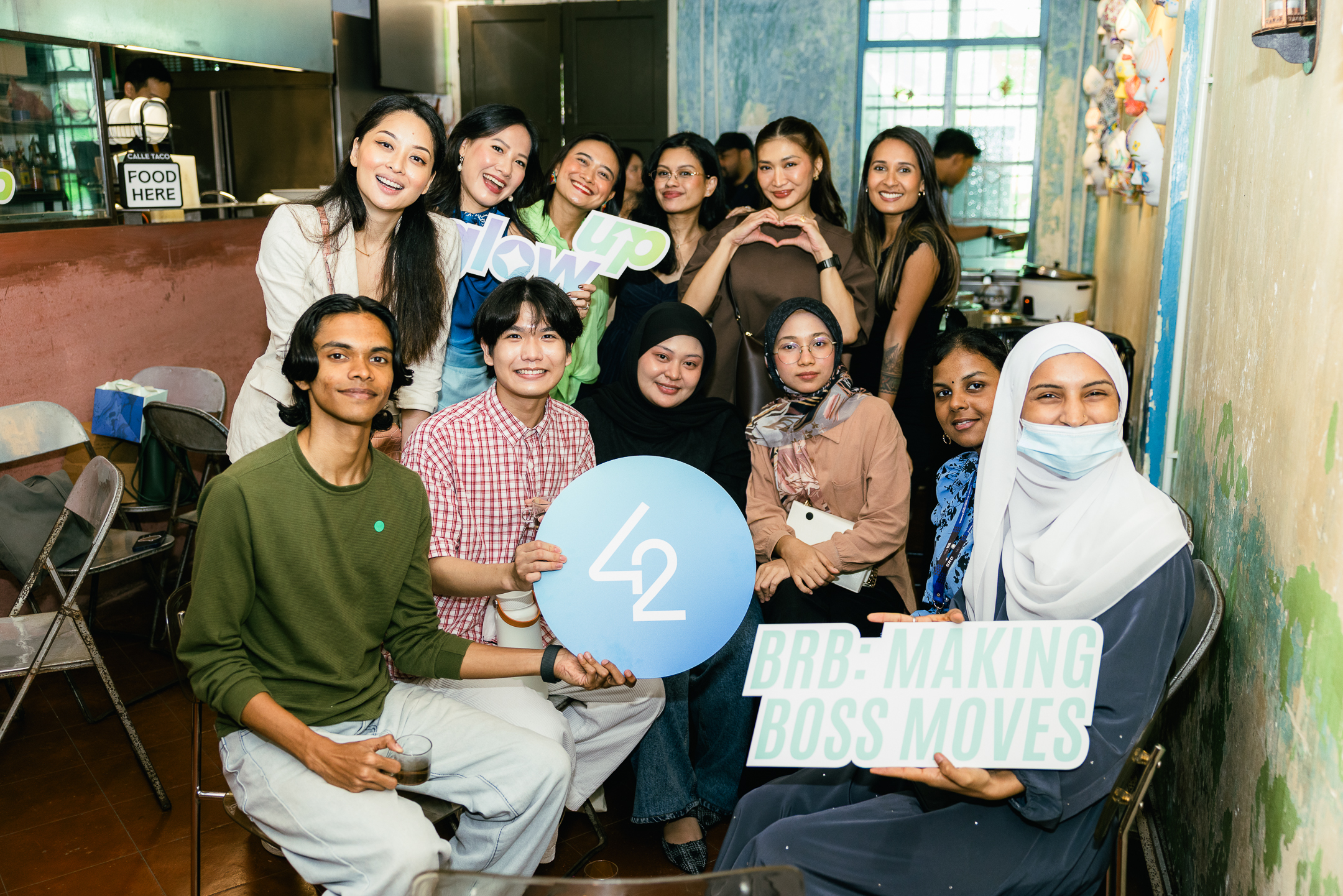
Photo gallery


More reads for you


Forget the Trade-off
Subscribe for inspiration and insights on doing well while doing good. No spam, we promise!